Mobile app to help promote mental health
MAVI
Feb 21 - Apr 21 (9 weeks)
Background
This project was done as part of completion of the course 50.006 UI Design and Implementation from SUTD and the theme was healthcare.
Tools and Methods
- Pen and Paper
- Figma
- Brainstorming
- Persona User Testing
Contribution
- User Research
- UI Design
- Prototyping
- User Testing
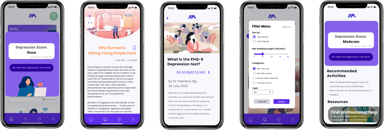
Project Description
Singaporean youth's mental health is on the red flag, with 79 of them taking their own lifes last year. One of the cause is the lack of clear access to help and resources. MAVI is a mobile app created to help youth gain access to various types of resources that could help them better themselves.
Design Process
Identifying the Problem with Research
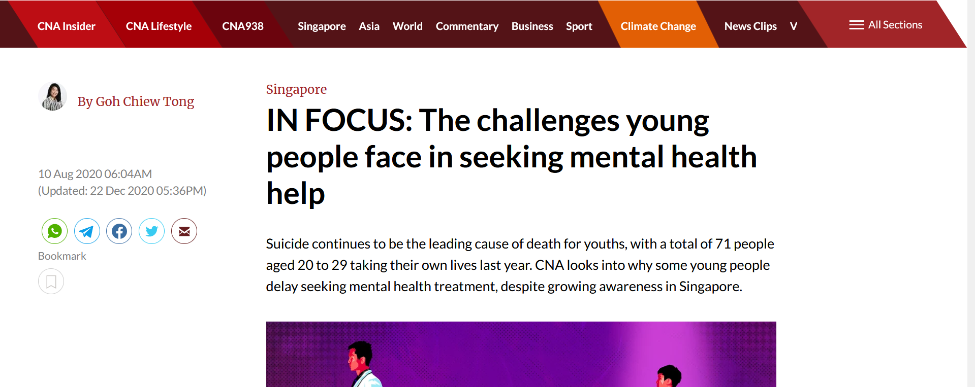
Considering how broad healthcare as a topic is, we used secondary research to narrow down the area of focus. One particular article released by CNA has drawn our attention. The article reported that suicide is still the highest leading cause of death among Singaporean youths and even detailed some of the causes. As youths ourselves, we thought this was heartbreaking and an issue worth pursuing.
Our initial assumption was youths had trouble finding mental health information online. To verify this assumption, we formulated a survey to get responses from our target user. We asked questions about the experience of finding resources online, the sources and also the usefulness of the information.
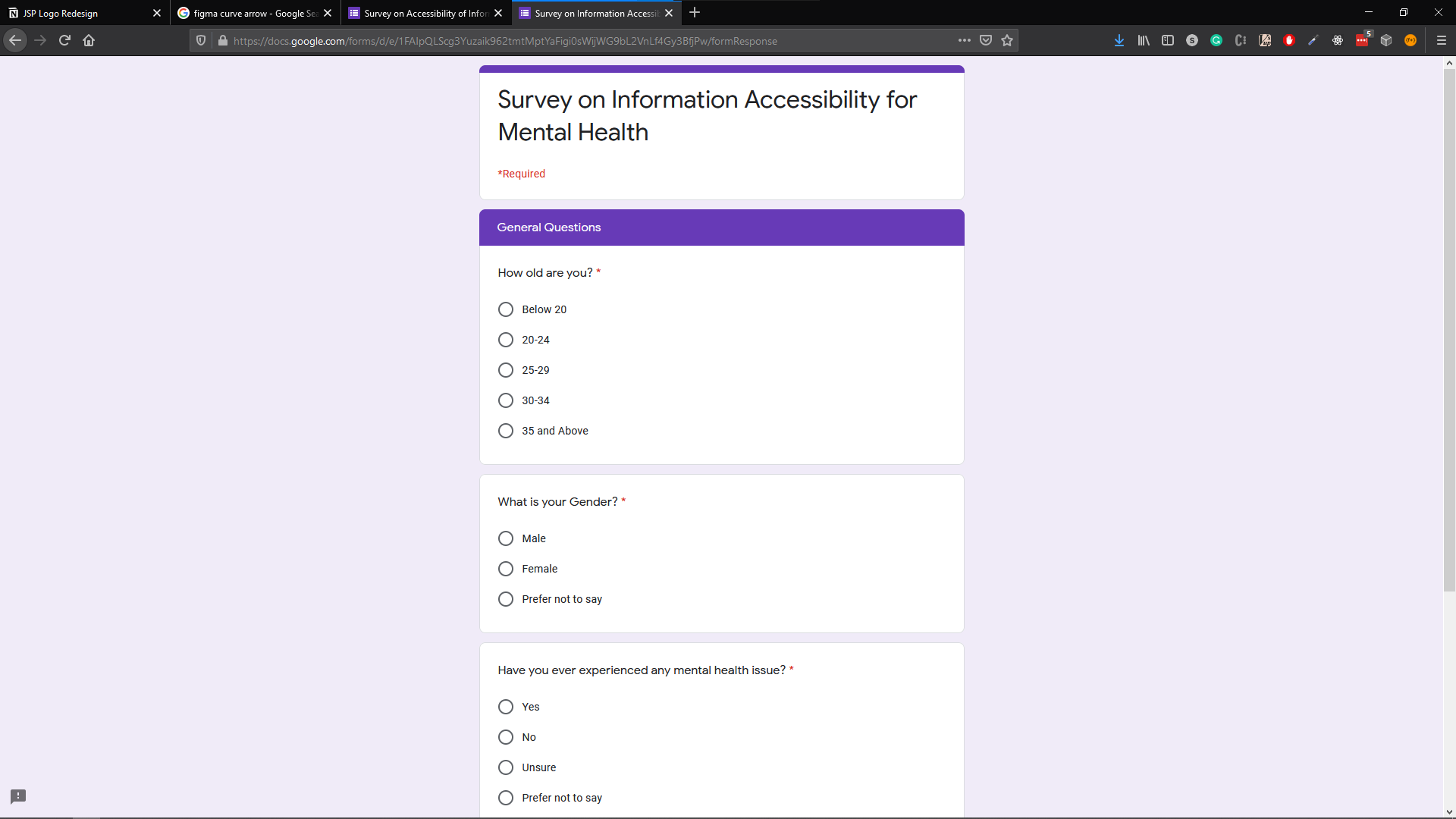
From the 54 responses gathered, we verified our assumptions, with
- - 38.5% indicated that the experience was confusing
- - 44.2% indicated that the experience was overwhelming
Key insights from research
- 1. People find confusing and overwhelming to find information online
- 2. People have trouble locating mental health services
- 3. People cannot effectively assess their mental health
- 4. People feels cognitive overload
Define
We formulated a problem statement to summarise our findings and the gap identified.
Problem Statement
Many Singaporean youths lack the guidance, time and effort to locate suitable treatments. Besides, the myriad of information online is overwhelming for those who already had trouble fighting their inner demons. These limitations prevent youths from bettering themselves and can even deteriorate their mental well-being. There needs to be a way that allows youths to access to get information on mental health easily and reliably.
Persona
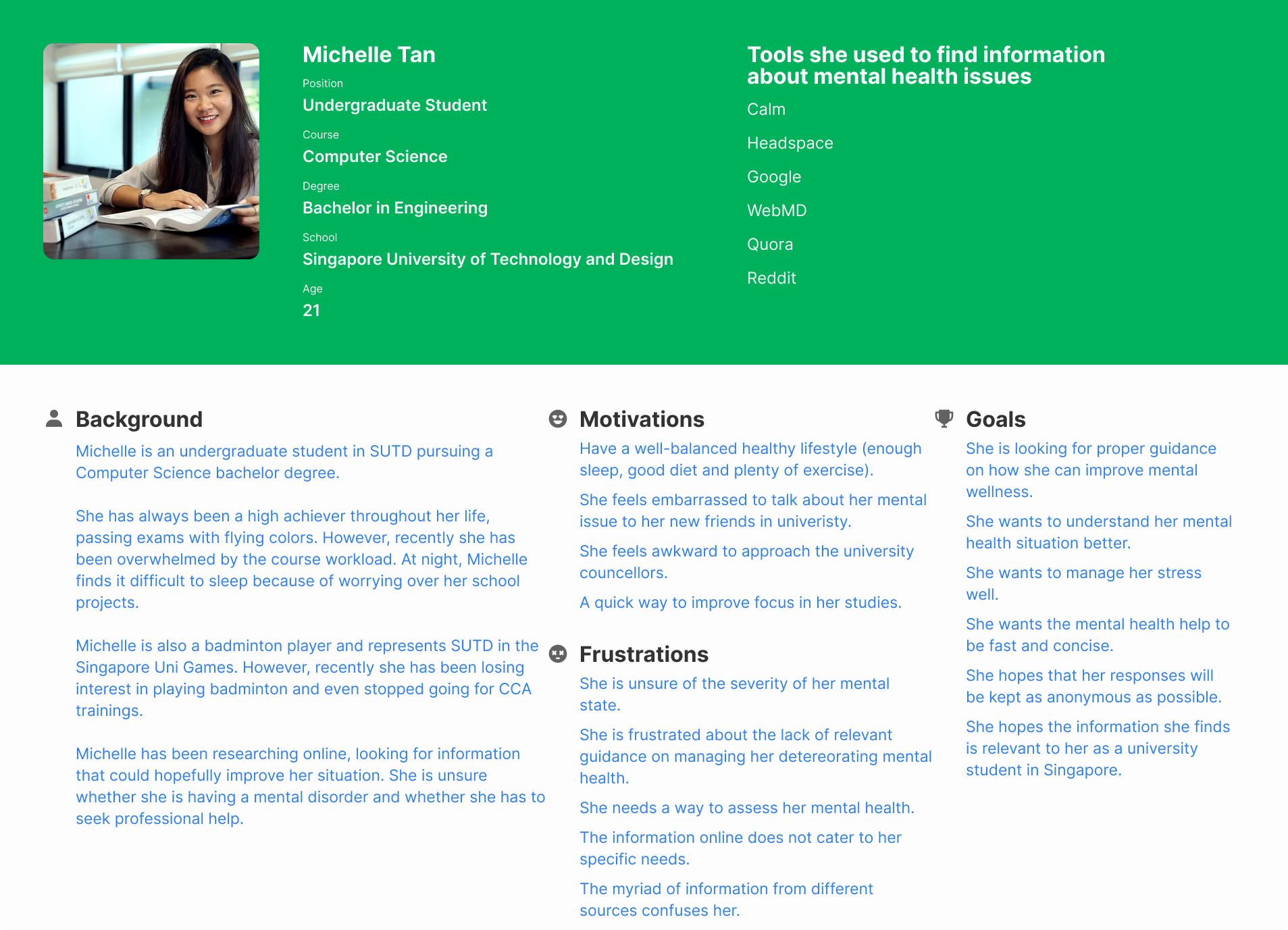
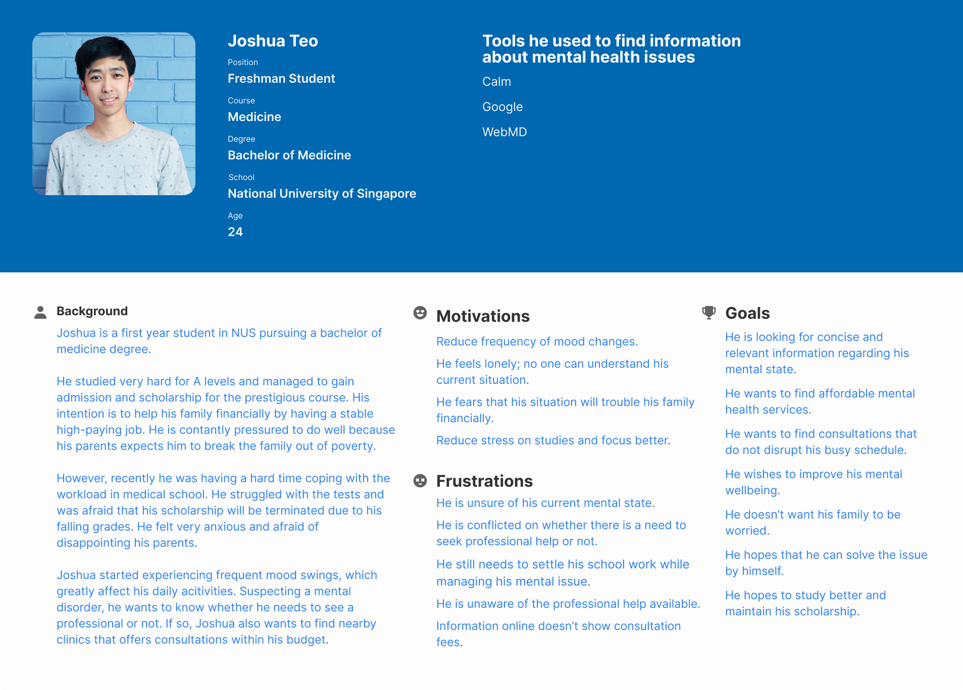
To kick start the design process, I suggested to create personas that we all can agree on so that could visualize our target users. Michelle was our first persona who represents someone who needs guidance on improving her mental health; Joshua was our second persona who represents someone who is looking for mental health services.
Ideate
As part of the brainstorming process, each member made sketched concepts of the applications. Individually, we experimented with layout, UI elements and the flow of the application. Then, we came together to review and synthesize our ideas, to pick out the common one and sort out the differences.
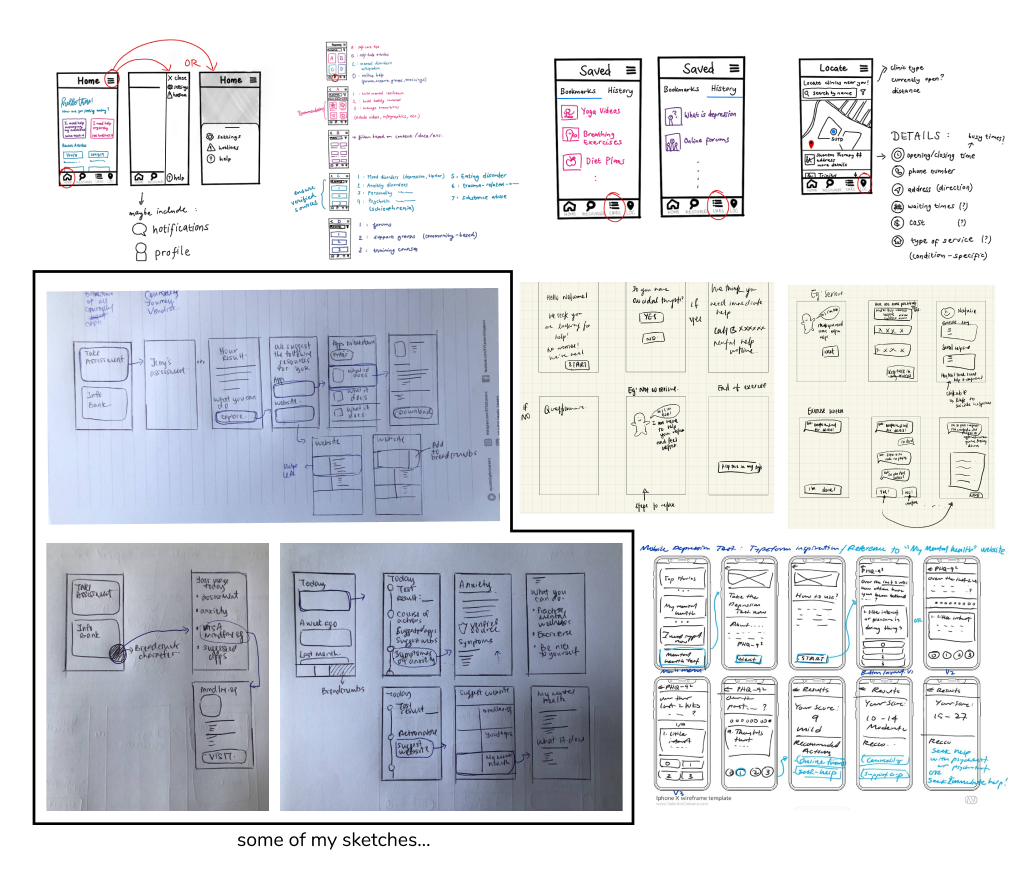
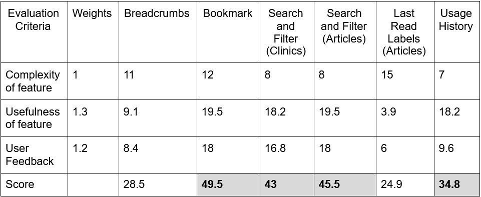
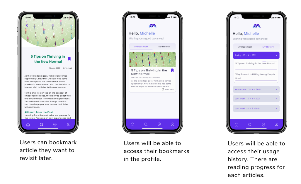
Some of the earlier ideas that were generated included a virtual assistant, dynamically adjusting cards, locating clinics and emergency calls. My ideas were to incorporate breadcrumbs and usage history into the mobile app for our users to help them set a sense of footing, so as to address the issue of feeling overwhelming. The two features were built on top of the idea that users would be able to access an extensive range of reliable information about mental health information. At the end of the brainstorming, we had an internal ranking process to decide ideas that did not reach a consensus.
Iterate (Prototype + Test)
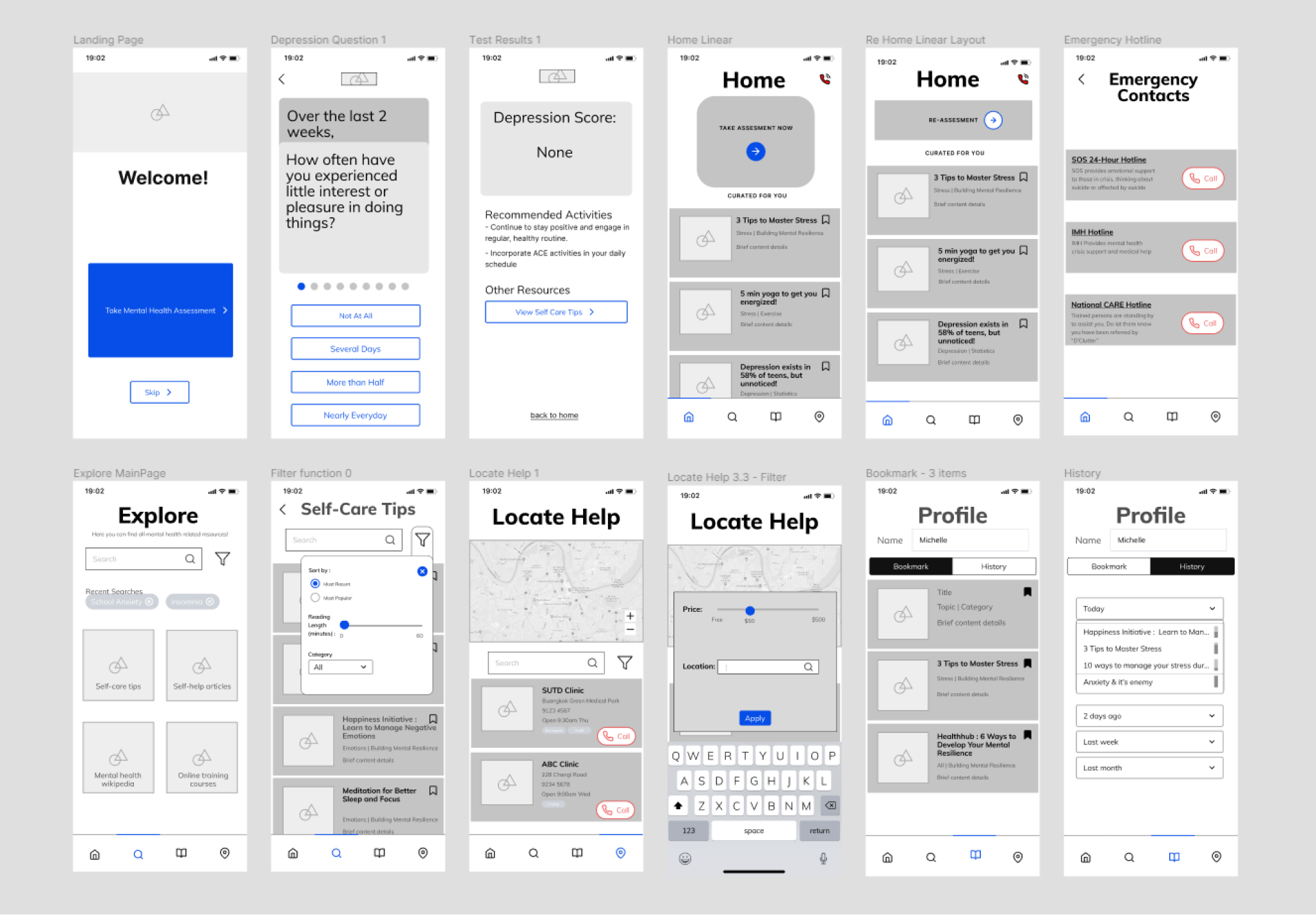
After a few rounds of internal discussions, we proceeded to create low-fidelity wireframes with a set of selected features from the previous stage. We had our first round of usability testing following the completion of wireframes.
Usability Testing
In total, we conducted two rounds of usability testings throughput the span of the project. We recruited 5 test participants in the first round and 6 test participants in the second round.
Usability Testing Methodology:
Test participants were presented with our prototype and a set of tasks to complete. The time taken to complete each task was recorded. Test participants were encouraged to think aloud when they were using the prototype so that the team could get a snapshot of user's thinking process. The team was distributed into sub-teams, with at least two persons in one sub-team. One team member would play the role of facilitator and while the others as observer. After our test participants finished all the task, we followed up with an informal chat (first round) to get their direct opinion and surveys (second round) to rate the prototype.
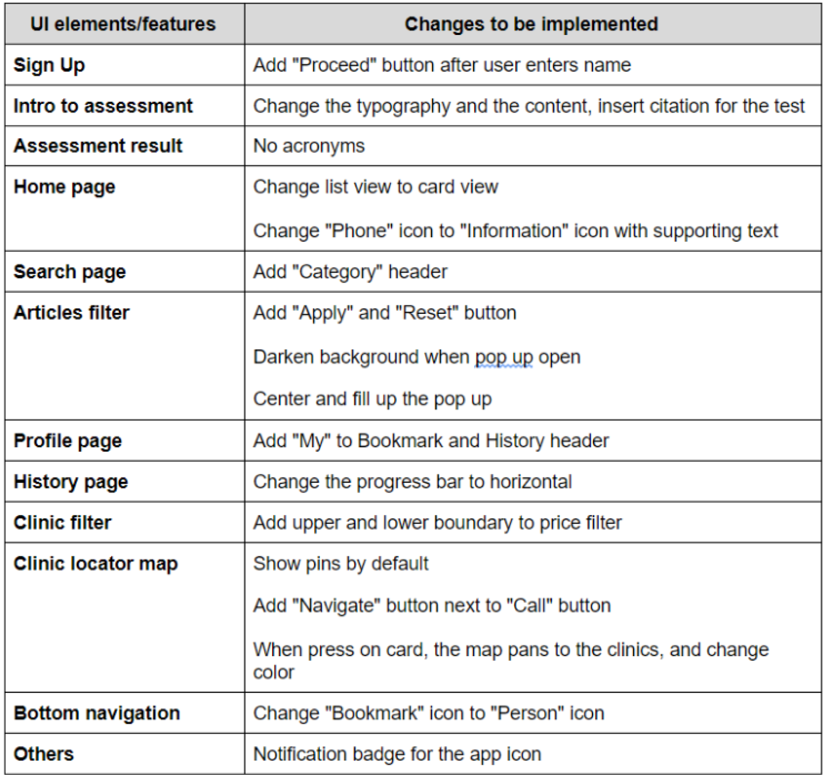
In our first round of testing, we carefully recorded the hiccups our users faced and after analysing them, we tabulated all the areas of improvement.
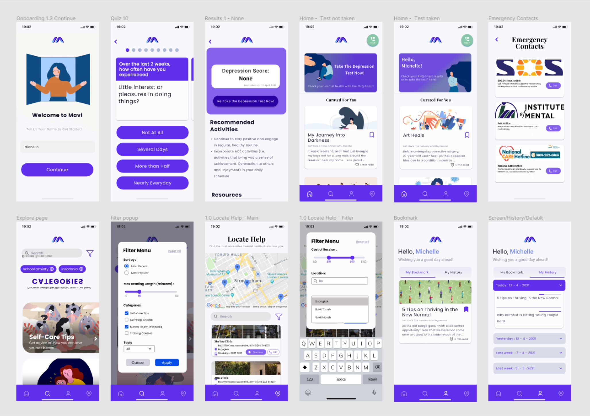
Following that was our first version of a high fidelity mock-up. The changes were implemented directly into the mock-up.
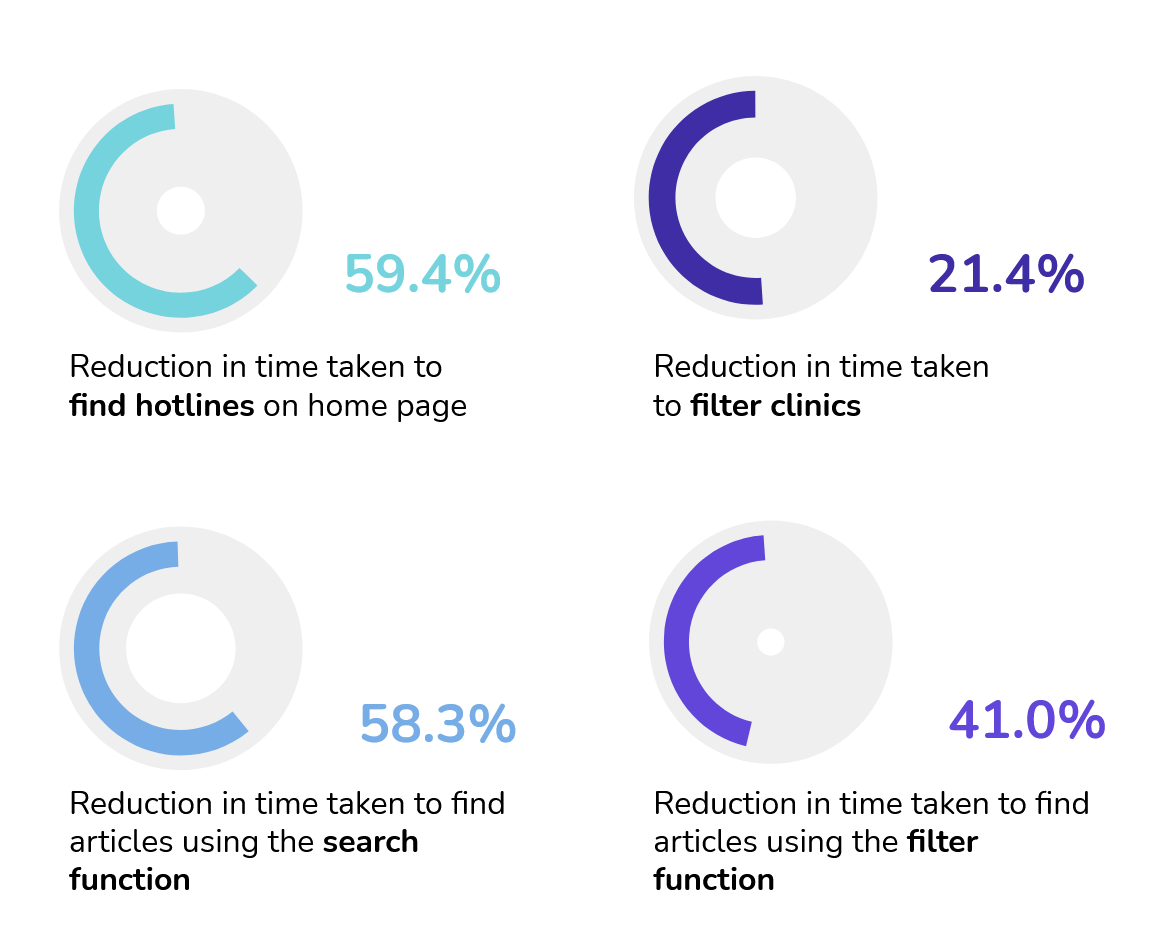
We did a second round of usability testing, using the same testing plan for the first round. In this round, we managed to see quantifiable improvements in the time taken for test participants to complete the tasks given.
Final Design
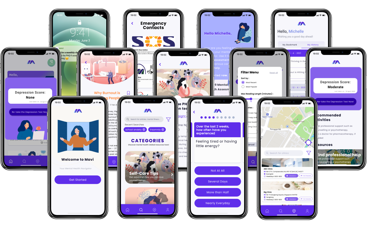
The second iteration is the final iteration of our design. From the previous usability testing, we were given some minor suggestions on the UI i.e. change the sequence of items in the bottom navigation and add a verbose placeholder in the search bar. Those changes were also implemented in this iteration.
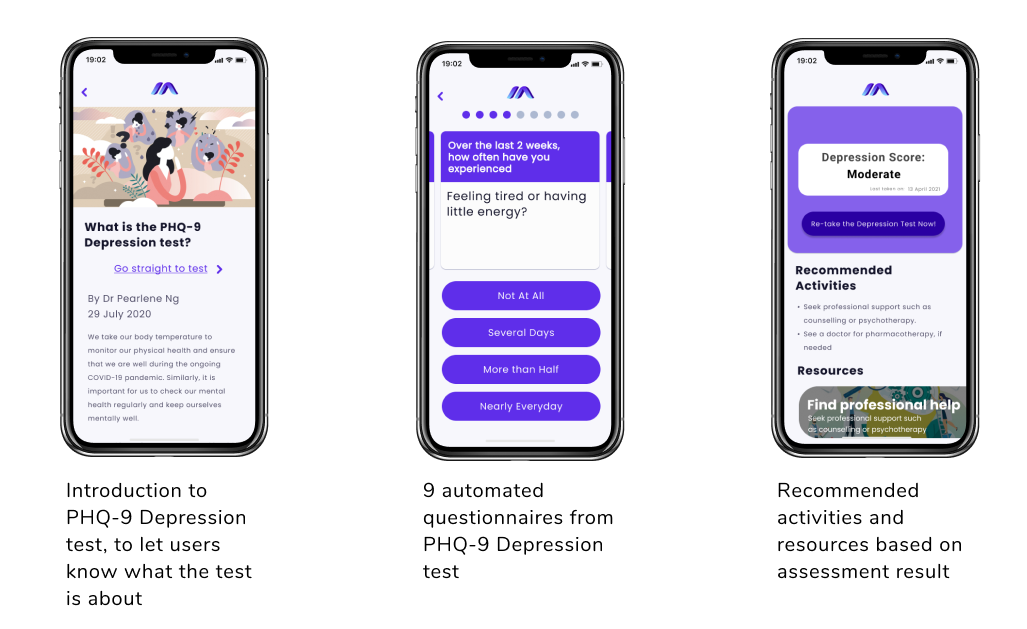
Feature 1 Mental health risk assessment with suggested contents
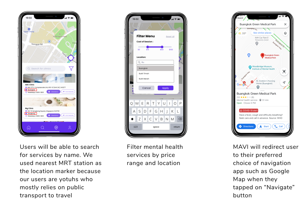
Feature 2 Mental health services locator
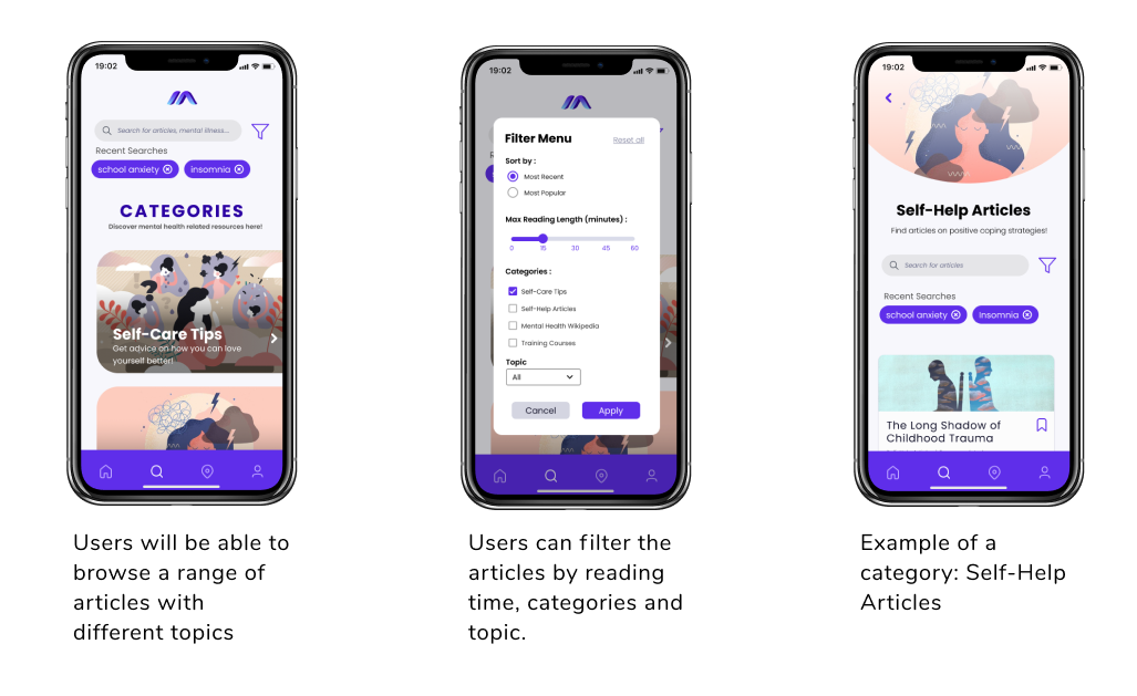
Feature 3 Resource hub with search and filtering
Feature 4 Article bookmarking and usage history
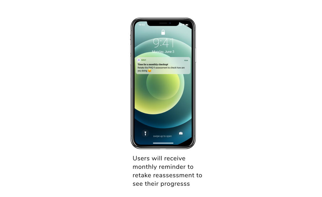
Feature 5 Reassessment reminder
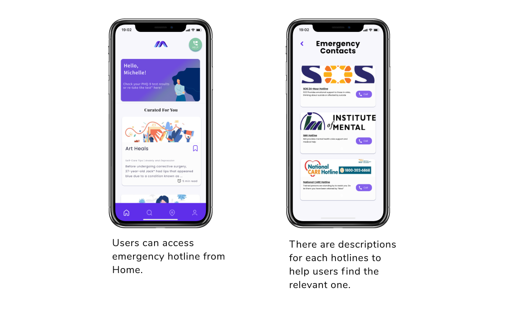
Feature 6 Emergency hotlines
I made a video demonstrating all the features, you can find it out here!
Branding
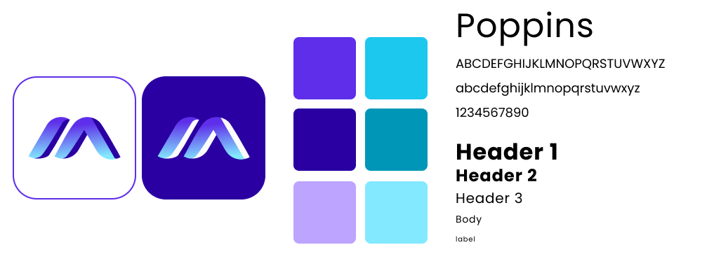
For this project, I also took the lead to work on the branding of the app. That includes the logo, colour scheme and typography. I chose purple and blue as the primary and secondary colour because they gave a sense of trust and peace. I opted for the san-serif font "Poppins" as the primary font because it appears to be more "friendly" to the users.
End of Testing Survey
At the end of the second round of usability, we invited our test participants to complete a usefulness and ease of use survey. The questions were adopted from the mHealth App Usability Questionnaire.
Usefulness Survey Result
The Good
50% strongly agrees that “The app would be useful for my mental health and well-being.”
83% strongly agrees that “The app improved my access to mental health care services.”
The Bad
Only 17% strongly agrees that “The app helped me manage my mental health effectively.”
(66.7% somewhat agree to the same statement. )
Ease of Use and Satisfactory Survey Result
The Good
100% agree with the statement: "The amount of time involved in using this app has been fitting for me."
66.67% agree with the following statements
- "Overall, I am satisfied with this app."
- "I would use this app again"
- "I like the interface of the app."
- "The app was easy to use"
- "It was easy for me to learn to use the app."
The Bad
33% disagree with the following statement "I feel comfortable using this app in social settings"
Lesson Learnt
From the survey results, we could certainly see some wins and losses. While we are able to meet the needs of our users, they do not feel comfortable using MAVI in a social setting. We hypothesize that they feel others might treat them differently and even distance themselves. It is unfortunate that we cannot speak about mental illness openly as it is still considered a taboo in the society. On the other hand, a rather low percentage of users strongly agreed that MAVI can help them manage their mental health effectively.
If I were to redo this project again, I would make sure the environmental factor is included as part of the analysis process and I would push forward the usefulness survey while we are in the ideation stage. Through that change, I believe MAVI would be a better product because we have our target users' opinion at the start of the process.
Personally speaking, I have learnt the importance of listening to our users. It was easy to get caught up with our own ideas and blame users when they don't understand them. However, we have to remember that the goal is to solve their problems, not to show off our ideas.
